Adaptive Web Design | Responsive UX for Websites
How do I make my site mobile-friendly? The Difference Between Fixed, Fluid, Adaptive and Responsive Design
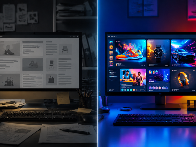
Consumers use mobile devices every day, and these devices are continually changing as technology develops. When trying to keep up with the times, your company’s website should be able to adapt to this continuous change. It’s best to know what your options are when marketing to your consumers online.
Many people know that “responsive design” is a popular strategy for making your website display well on multiple devices. However, what is commonly referred to as “responsive design” actually breaks down into three design types: fluid, adaptive, and responsive. We break down each one below so you can make sure you are getting exactly what you need when designing your new mobile-friendly website!
Fixed – A fixed website design is considered the beginning of website design. This is the type of template that was used for webpages when the internet first took off (this design is occasionally used today). It is the basic layout of a website with a fixed width, mainly made only for desktop computers. This means that if you were to view a fixed website on a smaller device, such as a tablet or smart phone, you will have to scroll the page left, right, up and down in order to see all of the content.
Fluid – When a website is fluid, the layout adjusts relative to the size of the screen. Percentages are used to determine how much of the screen width a certain element of the content will acquire. This type of design will adjust for any change in screen size. However, the smaller the device, the more cramped it can become and the columns of the page can break down in ways that aren’t easy for the user to navigate.
Adaptive – Adaptive website designs include set widths or relative widths, along with media queries so that the website content is presented differently depending on the device or browser size. If you view an adaptive website on a desktop and then on a tablet, you can see how the layout of the content adjusts to a new range of widths. This type of design will change at fixed screen sizes. The set resolution that would cause the site to adapt to the next design layout is referred to as the break point. The design will only change when it hits these break points. For example you may choose to have layouts adjust for desktops, tablets, and smart phones by setting the break points to standard resolutions for these devices.
Responsive – Responsive websites are a mixture of fluid and adaptive websites – the abilities of the two designs work together simultaneously whenever a browser is adjusted on a screen. Relative widths are used, as well as media queries, so that the website is able to fluidly change the design and layout whenever the screen or browser is adjusted. For this type of design you will use the custom break point layouts from adaptive design and the design will adjust fluidly when it is at a size between breakpoints. This makes it a great solution for many businesses who want their design to be more flexible than a standard adaptive design.
So, what type of design should your company choose? This decision is dependent upon how your audience views your website. They may visit your website on the go while using a smart phone or tablet, or most of your consumers may visit your website when they are sitting at their home or office computer. Making sure that you are building a website that is meeting your consumers’ needs is the most important piece of the puzzle.